UX/UI Design Project
Volition
An accessible app aimed to help disabled people make their own decisions.
.jpg)
The Brief
The existing media screens for the Volition app currently don't allow the user to delete files, name/rename files, re-order media, or select hero images.
This is a problem because Volition is an app that aims to allow users to document and capture their insights. By allowing the users to express their decisions, making them decision makers of their own lives.
My task is to redesign the media screens to allow users to delete files, name/rename files, re-order media, or select hero images, whilst maintaining design consistency and following accessibility standards.
Current media screen

Edit button doesn't allow users to go anywhere
Huge pain point for all users as:
-
Users cant delete media
-
Users cant edit text
-
Users cant select photos
Manage media button also doesn't allow users to go anywhere
Brainstorming
Experimented with colours and layout
Exploring design ideas for deleting media
.jpg)
.png)

.png)
.png)
.png)
.png)
Exploring design ideas for selecting hero image
.png)
.png)
.png)
.png)
.png)
.png)
.png)
Exploring design ideas for empty state (if no media exist)


.png)
Prototyping
Used all relevant ideas and created a quick prototype to gain feedback from designer and developers.
Flow 1 : When user clicks directly onto the image from media screen

Flow 2 : When user clicks on edit for manage media


Feedback and Design Changes
Problem 1 - Editing Media
-
When clicking edit, the edit button disappears. "How do users get out of this screen?, Can this be made more visible?"
-
Crop feature is also a very low priority; this may also be more complex and time-consuming for developers to build
-
Check the alignments of the various options icons and labels
.png)
.png)
Before
Problem 2 - Deleting Media
-
Confirmation for deleting media doesn't feel consistent with other existing screens
Before
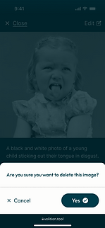.png)
.png)
Solution
-
Clearly show the edit and back buttons to help users
-
Removed crop feature
-
Re-aligned icons and labels
After
.png)
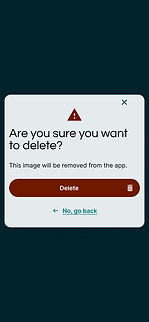
Solution
-
Used the existing screen to keep design pop-ups consistent. This also helps the developers as they can reuse a screen and save time.
After
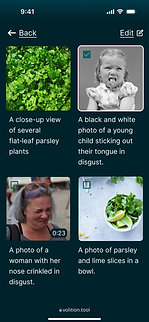
Problem 3 - Types of Media
-
When users want to add media, we need to think about other types of media that users would like to include in their preferences besides videos and photos
Before
.png)
Solution
-
Incorporated an options menu bar so users can easily navigate between different types of media
-
Added a search bar so users can quickly find media
-
Added a filter option to help users easily find their most recent preferences added
After
.png)
.png)
Problem 4 - Dark to Light Mode
-
Developers were concerned that the majority of the managed media screens were too dark, as this would affect how dark mode would look.
Before
Solution
-
Got rid of the dark colours on most screens but kept it for deleting media to maintain consistency across the app.
After
.png)
Final Design
Final design with all changes made across the app.


.png)
.png)
.png)
.png)
.png)
.png)
.png)
.png)
.png)
.png)
.png)
.png)
.png)
.png)
Prototype
If you would like the view the prototype, Click Here